Getting Back into the Swing of Things

Well, it’s been a hot minute since my last post (whoops!). I’ve been busy with bobsledders and job hunting this summer, but I’ve finally found a bit of time to get back to the ole blog now that bobsled’s summer training is winding down and I’m preparing for an intercontinental move (keep an eye on Twitter for related news).
A ton of great papers have come out this summer focused on various aspects of athlete monitoring. One that I particularly enjoyed was “Putting the ‘I’ Back in Team” by Patrick Ward, Aaron Coutts, Ricard Pruna, and Alan McCall [6]. They didn’t discuss anything groundbreaking, but it was nice to see statistical process control get a bit more love (for additional commentary on SPC, see Sands et al. [5]) while dancing around the idea of anomaly detection via modeling. The latter has been particularly interesting to me for the last year or so, but I haven’t gotten past the “fiddling stage” in R until the last month. We’ll get deeper into SPC today and will touch on anomaly detection in Part 2.
Statistical Process Control (SPC)

Like many of the other statistical techniques used in sports science, SPC has been borrowed from the business analytics world, specifically manufacturing quality control. The underlying theory of SPC is pretty straightforward–all “processes” possess a certain amount of variation or noise. Some of this variation is idiosyncratic (inherent to the individual process being studied), whereas additional unexplained variation may be introduced through alterations in the process. Processes experiencing normal variation are said to be “in control” or “stable” while a process experiencing random/intermittent unexplained variation outside its norm is considered “out of control.” Perfectly clear? Great!
…In reality, that definition probably didn’t make a lot of sense. Let’s try again with a very practical example. The last few years, I’ve used weighted squat jumps (SJ) as a fatigue monitoring tool. My rationale for using weighted SJ came from my thesis and from a handful of papers that have shown SJ height from flight time may be more sensitive to fatigue state than countermovement jump (CMJ) height from flight time [1–4]. Each athlete will have their own “normal”–that is, a day-to-day range they will stay within when under “normal” levels of fatigue and when no training adaptations have occurred (strength changes, etc.). This range represents the athlete’s typical variation in their jump performance and will be inherent to that athlete. Some athletes will have a very tight inter-day variation in jump height (< 1 cm), whereas others may have greater inter-day fluctuations (2 - 4 cm). When the athlete’s jump height is within their normal range, we can say with relative certainty that the process of their SJ height is “in control.” In the case of using SJ height as a proxy measure of fatigue state, we can assert that the athlete is not experiencing undue levels of fatigue…Well, maybe. Don’t rely on a single metric to solve all of life’s problems. If, however, the athlete’s jump height falls below an arbitrarily set threshold (typically 1 - 2 SD below their average), they can be flagged for deeper analysis and potential intervention as their SJ height is now “out of control.” This suggests they may be experiencing elevated levels of fatigue.
Performing SPC in R
It’s always easier to understand this stuff with visuals. If you’d like to follow along, the data can be found here. Let’s see what we’re working with:
| jumpDate | athlete | jumpType | flightTime | session |
|---|---|---|---|---|
| 2015-08-15 | Benjamin Babatunde | SJ | 0.60 | BL |
| 2015-08-15 | Benjamin Babatunde | SJ | 0.61 | BL |
| 2015-08-15 | Joo Garand | SJ | 0.62 | BL |
| 2015-08-15 | Joo Garand | SJ | 0.62 | BL |
| 2015-08-15 | Steve Galligan | SJ | 0.57 | BL |
| 2015-08-15 | Steve Galligan | SJ | 0.57 | BL |
| 2015-08-15 | Jungsoo Moua | SJ | 0.58 | BL |
| 2015-08-15 | Jungsoo Moua | SJ | 0.58 | BL |
| 2015-08-15 | Naadir el-Mahdavi | SJ | 0.63 | BL |
| 2015-08-15 | Naadir el-Mahdavi | SJ | 0.62 | BL |
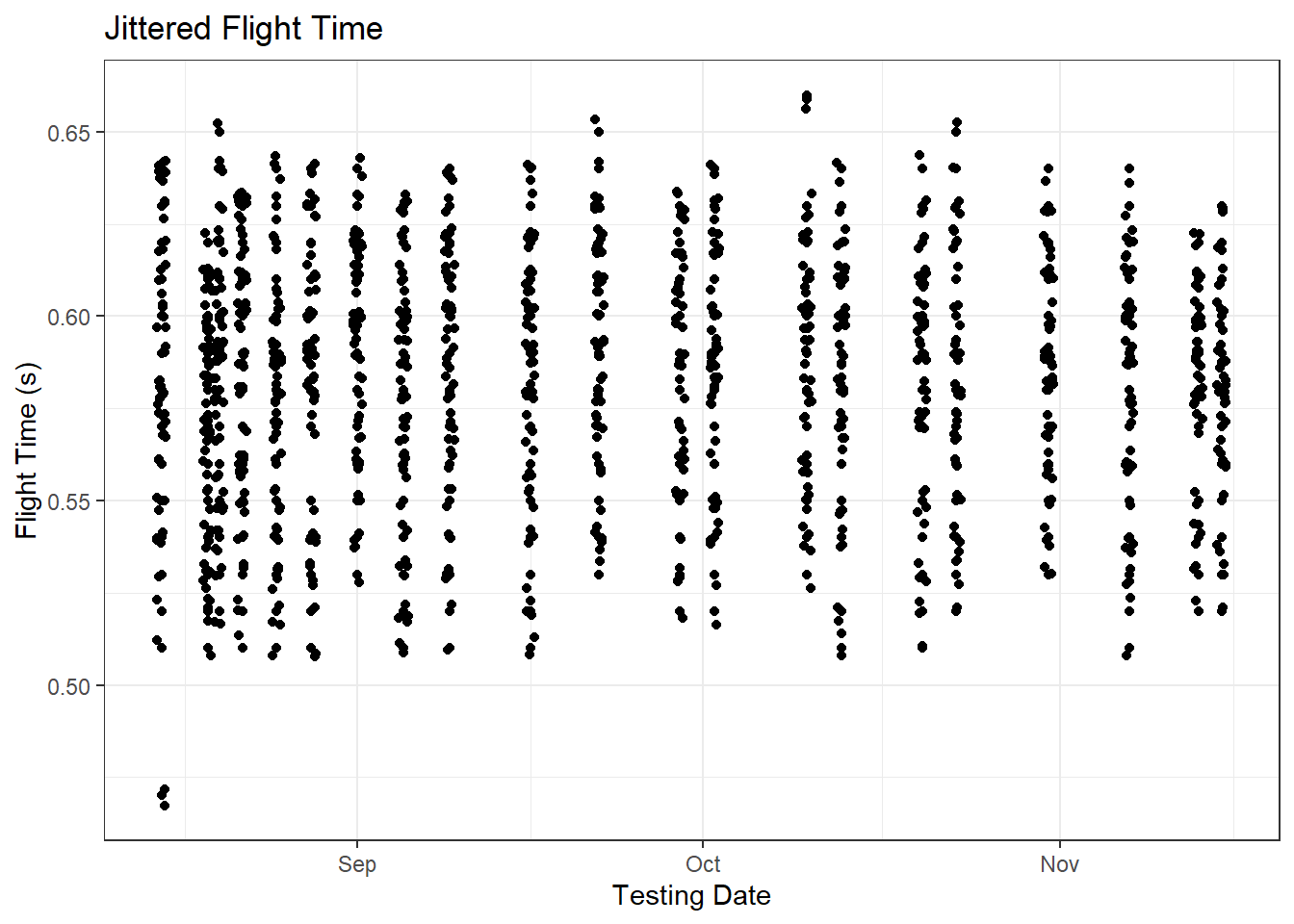
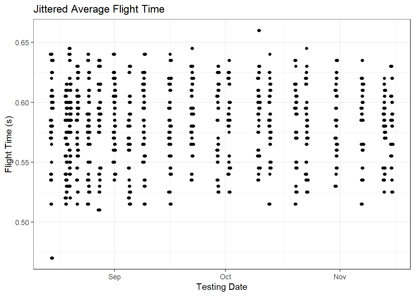
These are real flight time values measured on switch mats, although the athletes’ names have been randomized. The data come from 21 vertical jump testing sessions across a fall season and include 1 “baseline” testing session and 20 in-season testing sessions that were carried out ~ 4 hours before most of the season’s matches. Each athlete completed 2 - 3 trials at each testing session, and the two closest trials were stored in the monitoring database.
First things first, we need to obtain session averages for each athlete. I know dplyr tends to be the go-to for data manipulation, so I’ve included both dplyr and data.table (my personal favorite) versions of the code throughout the remainder of the post. One of these days, I’ll get around to discussing the usefulness of using dplyr and data.table together…one day.
# Importing the data
jump.data <- read.csv('jump-data.csv')

# We need to convert the dates from factor to date type
jump.data$jumpDate <- as.Date(jump.data$jumpDate)

# dplyr syntax
dplyr.jump.means <- jump.data %>% group_by(jumpDate, athlete) %>%
  summarise(avg_ft = mean(flightTime))

# data.table syntax
jump.data <- data.table(jump.data)

dt.jump.means <- jump.data[, .(avg_ft = mean(flightTime)), by = .(jumpDate, athlete)]
In either case, we now have mean session values for each athlete:
| jumpDate | athlete | avg_ft |
|---|---|---|
| 2015-08-15 | Benjamin Babatunde | 0.605 |
| 2015-08-15 | Joo Garand | 0.620 |
| 2015-08-15 | Steve Galligan | 0.570 |
| 2015-08-15 | Jungsoo Moua | 0.580 |
| 2015-08-15 | Naadir el-Mahdavi | 0.625 |
| 2015-08-15 | Brandon Troxel | 0.540 |
| 2015-08-15 | Aqeel al-Hossain | 0.640 |
| 2015-08-15 | Darin Russell | 0.575 |
| 2015-08-15 | Aiden Jaeger | 0.535 |
| 2015-08-15 | Tony Cha | 0.635 |
We need a few more pieces of information to create control charts for our analysis–namely, each athlete’s overall mean flight time and the standard deviation of their flight times:
# dplyr syntax
dplyr.jump.means <- dplyr.jump.means %>% group_by(athlete) %>%
  mutate(ind_mean = round(mean(avg_ft), 3),
         ind_sd = round(sd(avg_ft), 3))

# data.table syntax
dt.jump.means[, ':=' (ind_mean = round(mean(avg_ft), 3),
                      ind_sd = round(sd(avg_ft), 3)), by = athlete]

knitr::kable(dt.jump.means[1:10,])| jumpDate | athlete | avg_ft | ind_mean | ind_sd |
|---|---|---|---|---|
| 2015-08-15 | Benjamin Babatunde | 0.605 | 0.613 | 0.014 |
| 2015-08-15 | Joo Garand | 0.620 | 0.618 | 0.013 |
| 2015-08-15 | Steve Galligan | 0.570 | 0.587 | 0.010 |
| 2015-08-15 | Jungsoo Moua | 0.580 | 0.575 | 0.010 |
| 2015-08-15 | Naadir el-Mahdavi | 0.625 | 0.596 | 0.020 |
| 2015-08-15 | Brandon Troxel | 0.540 | 0.540 | 0.019 |
| 2015-08-15 | Aqeel al-Hossain | 0.640 | 0.597 | 0.017 |
| 2015-08-15 | Darin Russell | 0.575 | 0.538 | 0.017 |
| 2015-08-15 | Aiden Jaeger | 0.535 | 0.549 | 0.025 |
| 2015-08-15 | Tony Cha | 0.635 | 0.616 | 0.020 |
Once we have the athletes’ means and standard deviations, we can calculate their upper and lower control limits. In this example, I’m using limits of mean ± 1.5 SD:
# dplyr syntax
dplyr.jump.means <- dplyr.jump.means %>% group_by(athlete) %>%
  mutate(upper_limit = round(ind_mean + 1.5 * ind_sd, 3),
         lower_limit = round(ind_mean - 1.5 * ind_sd, 3)) %>% ungroup()

# data.table syntax
dt.jump.means[, ':=' (upper_limit = round(ind_mean + 1.5 * ind_sd, 3),
                      lower_limit = round(ind_mean - 1.5 * ind_sd, 3)),
              by = athlete]

knitr::kable(dt.jump.means[1:10,])| jumpDate | athlete | avg_ft | ind_mean | ind_sd | upper_limit | lower_limit |
|---|---|---|---|---|---|---|
| 2015-08-15 | Benjamin Babatunde | 0.605 | 0.613 | 0.014 | 0.634 | 0.592 |
| 2015-08-15 | Joo Garand | 0.620 | 0.618 | 0.013 | 0.638 | 0.598 |
| 2015-08-15 | Steve Galligan | 0.570 | 0.587 | 0.010 | 0.602 | 0.572 |
| 2015-08-15 | Jungsoo Moua | 0.580 | 0.575 | 0.010 | 0.590 | 0.560 |
| 2015-08-15 | Naadir el-Mahdavi | 0.625 | 0.596 | 0.020 | 0.626 | 0.566 |
| 2015-08-15 | Brandon Troxel | 0.540 | 0.540 | 0.019 | 0.568 | 0.512 |
| 2015-08-15 | Aqeel al-Hossain | 0.640 | 0.597 | 0.017 | 0.622 | 0.572 |
| 2015-08-15 | Darin Russell | 0.575 | 0.538 | 0.017 | 0.564 | 0.513 |
| 2015-08-15 | Aiden Jaeger | 0.535 | 0.549 | 0.025 | 0.586 | 0.512 |
| 2015-08-15 | Tony Cha | 0.635 | 0.616 | 0.020 | 0.646 | 0.586 |
Now we have everything we need to plot control charts for our athletes. To start, I’m only going to plot the data from a single athlete because things can get cluttered pretty quickly.
# Plot a single athlete's data
ggplot(dt.jump.means[athlete == 'Steve Galligan'], aes(x = jumpDate, y = avg_ft)) +
  geom_point() + geom_line() +
  geom_hline(aes(yintercept = ind_mean)) +
  geom_hline(aes(yintercept = upper_limit), linetype = 'dotdash') +
  geom_hline(aes(yintercept = lower_limit), linetype = 'dotdash') + theme_bw() +
  labs(title = 'Jumps Over Time', x = 'Testing Date', y = 'Flight Time (s)')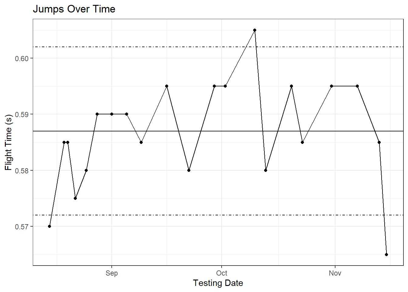
Now we have a very basic control chart worked out. Obviously, we’re examining the data retrospectively for an athlete we managed relatively well so a majority of his flight time values fall within his control limits (the drop you see at the end was after Friday-Sunday double overtime games where he played 110 minutes each game). Examining the plot brings up an important issue with SPC, though: process shifts. If you take a look at the first few testing sessions of the season, there is a noticeable increase in his performance leading into September. From knowing this athlete, I can tell you he came in unfit and having performed zero strength training that summer so his increased jump performance was to be expected. It’s safe to assume that we’ve captured his fitness changes in our monitoring data, and these fitness changes have created a process shift in his vertical jump performance. Not accounting for this shift will artificially inflate the control limits, which could cause us to miss otherwise important decreases in his monitoring data.
So how can we deal with process shifts? Your chosen solution will ultimately boil down to how much free time you have, but I’ll wager most of you reading don’t have a lot. One of the easiest solutions is to use a rolling window approach to calculate your individual means and standard deviations. Like most things in sports science, there are no rules for rolling window size, but I would say whatever your window size is for your chronic rolling window (if you’re using A:C calculations) is a good place to start. For us, that was a 28-day window. So let’s reacalculate our limits and plot the data for the final 28 days of the season:
# dplyr syntax using "chaining"
dplyr.recent.jumps <- dplyr.jump.means %>% filter(jumpDate >= max(jumpDate) - 28) %>%
  group_by(athlete) %>% mutate(ind_mean = mean(avg_ft),
                               ind_sd = sd(avg_ft),
                               upper_limit = ind_mean + 1.5 * ind_sd,
                               lower_limit = ind_mean - 1.5 * ind_sd)

# data.table syntax using chaining; data.table functions a little differently
dt.recent.jumps <- dt.jump.means[jumpDate >= max(jumpDate) - 28]

dt.recent.jumps[, ':=' (ind_mean = mean(avg_ft),
                        ind_sd = sd(avg_ft)),
                by = athlete][, ':=' (upper_limit = ind_mean + 1.5 * ind_sd,
                                      lower_limit = ind_mean - 1.5 * ind_sd),
                              by = athlete]

ggplot(dt.recent.jumps[athlete == 'Steve Galligan'], aes(x = jumpDate, y = avg_ft)) +
  geom_point() + geom_line() +
  geom_hline(aes(yintercept = ind_mean)) +
  geom_hline(aes(yintercept = upper_limit), linetype = 'dotdash') +
  geom_hline(aes(yintercept = lower_limit), linetype = 'dotdash') + theme_bw() +
  labs(title = 'Jumps Over Time', x = 'Testing Date', y = 'Flight Time (s)')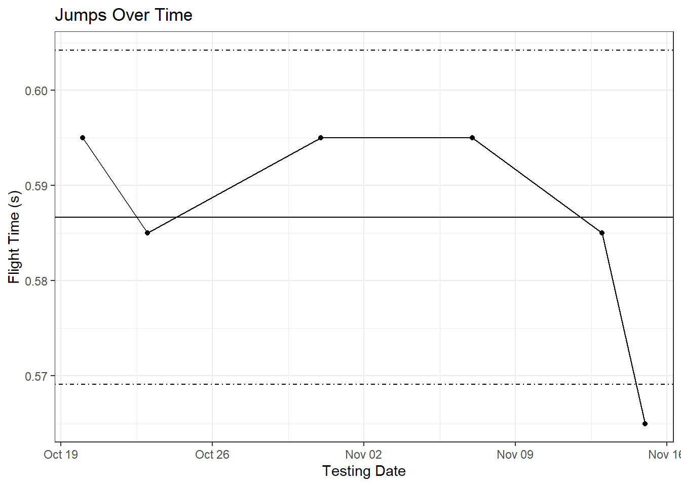
In both cases, the final testing session of the season fell below the athlete’s control limits, so both roads would have led to Rome. While this approach worked in the current case, you may have to adjust your window based on the frequency of your testing. For the year in question, we tested every ~ 4 days, but the next season was closer to every 10 days. Implementing a 28-day rolling window for both seasons would provide drastically different numbers of sessions for our calculations. In the case of a college sport, an alternative may be removal of the pre-season from the calculations. Ultimately, though, this will be an individualized decision based on your specific testing and monitoring setup.
Getting Fancy
There are no hard and fast rules for what threshold constitutes an out of control process. For instance, a threshold of 1 SD (.16 probability of occurring by random chance) may be too reactive to otherwise harmless fluctuations in performance while a threshold of 2 SD (.025 probability of occurring by random chance) may be too strict [5,6]. Personally, I prefer a threshold of 1.5 SD (.065 probability of occurring by random chance), but other methods such as setting an “alert” threshold and a “warning” threshold (e.g. 1 SD = alert and 1.5 or 2 SD = warning) or implementing more sophisticated rules (see Wikipedia for a discussion on different rule sets) are also possible [6].
For example, let’s apply alert (1 SD) and warning (1.5 SD) thresholds to our data from the first example.
# dplyr syntax
dplyr.jump.means <- dplyr.jump.means %>% group_by(athlete) %>%
  rename(upper_limit_1.5SD = upper_limit, lower_limit_1.5SD = lower_limit) %>%
  mutate(upper_limit_1SD = round(ind_mean + ind_sd, 3),
         lower_limit_1SD = round(ind_mean - ind_sd, 3)) %>% ungroup()

# data.table syntax
setnames(dt.jump.means,
         old = c('upper_limit', 'lower_limit'),
         new = c('upper_limit_1.5SD', 'lower_limit_1.5SD'))

dt.jump.means[, ':=' (upper_limit_1SD = round(ind_mean + ind_sd, 3),
                      lower_limit_1SD = round(ind_mean - ind_sd, 3)
                      ), by = athlete]

ggplot(dt.jump.means[athlete == 'Steve Galligan'], aes(x = jumpDate, y = avg_ft)) +
  geom_point() +
  geom_line() +
  geom_hline(aes(yintercept = ind_mean)) +
  geom_hline(aes(yintercept = lower_limit_1.5SD)) +
  geom_hline(aes(yintercept = upper_limit_1.5SD)) +
  geom_hline(aes(yintercept = lower_limit_1SD), linetype = 'dashed') +
  geom_hline(aes(yintercept = upper_limit_1SD), linetype = 'dashed') +
  theme_bw() +
  labs(title = 'Jumps Over Time', x = 'Testing Date', y = 'Flight Time (s)')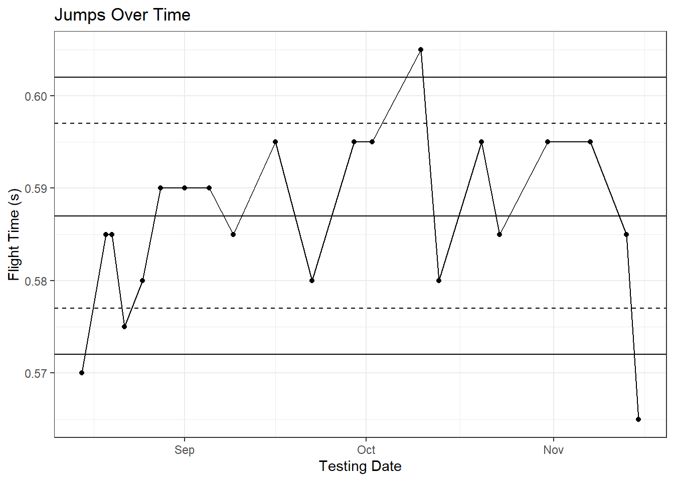
It’s also possible to color code the plots based on whether they violate your chosen thresholds or more advanced rule sets. The code gets very messy (I originally included example code but removed it because it was difficult to follow), so if you want to use color coding or more advanced rule sets, I would seriously recommend exploring one of the specially-built SPC packages available on CRAN. qcc, for instance, can create both individual control charts (“I” charts) and EWMA-based charts. Selection on chart type will depend on the amount of data you have and the window size you’ve chosen.
Wrapping Up
If you really want to go down the SPC rabbit hole, there are R packages dedicated to SPC analysis (spc, qicharts, qcc). I’ve played around with qcc a bit to create both “I” and EWMA control charts, but I don’t have enough experience with the package to provide any sort of guidance.
I had originally planned on covering anomaly detection in this post as well, but I’m pretty sure all our brains would be mush by the end. Look for Part 2 to drop in the next few days! In the meantime, feel free to drop me a line on twitter or email me at samsperformancetraining@gmail.com.
Code Recap
To recap the code used in Part 1:
# Required packages
library(data.table)
library(ggplot2)
library(knitr)
library(dplyr)

# Importing the data
jump.data <- read.csv('3-Individual_Monitoring/jump-data.csv')

# We need to convert the dates from factor to date type
jump.data$jumpDate <- as.Date(jump.data$jumpDate)

# --- Session Averages --- #

# dplyr syntax
dplyr.jump.means <- jump.data %>% group_by(jumpDate, athlete) %>%
  summarise(avg_ft = mean(flightTime))

# data.table syntax
jump.data <- data.table(jump.data)

dt.jump.means <- jump.data[, .(avg_ft = mean(flightTime)), by = .(jumpDate, athlete)]

# --- Individual Averages and SD --- #
# dplyr syntax
dplyr.jump.means <- dplyr.jump.means %>% group_by(athlete) %>%
  mutate(ind_mean = round(mean(avg_ft), 3),
         ind_sd = round(sd(avg_ft), 3))

# data.table syntax
dt.jump.means[, ':=' (ind_mean = round(mean(avg_ft), 3),
                      ind_sd = round(sd(avg_ft), 3)), by = athlete]

# --- Plot 1 --- #
# Plot a single athlete's data
ggplot(dt.jump.means[athlete == 'Steve Galligan'], aes(x = jumpDate, y = avg_ft)) +
  geom_point() + geom_line() +
  geom_hline(aes(yintercept = ind_mean)) +
  geom_hline(aes(yintercept = upper_limit), linetype = 'dotdash') +
  geom_hline(aes(yintercept = lower_limit), linetype = 'dotdash') + theme_bw() +
  labs(title = 'Jumps Over Time', x = 'Testing Date', y = 'Flight Time (s)')

# --- Rolling Window and Plot --- #
# dplyr syntax using "chaining"
dplyr.recent.jumps <- dplyr.jump.means %>% filter(jumpDate >= max(jumpDate) - 28) %>%
  group_by(athlete) %>% mutate(ind_mean = mean(avg_ft),
                               ind_sd = sd(avg_ft),
                               upper_limit = ind_mean + 1.5 * ind_sd,
                               lower_limit = ind_mean - 1.5 * ind_sd)

# data.table syntax using chaining; data.table functions a little differently
dt.recent.jumps <- dt.jump.means[jumpDate >= max(jumpDate) - 28]

dt.recent.jumps[, ':=' (ind_mean = mean(avg_ft),
                        ind_sd = sd(avg_ft)),
                by = athlete][, ':=' (upper_limit = ind_mean + 1.5 * ind_sd,
                                      lower_limit = ind_mean - 1.5 * ind_sd),
                              by = athlete]

ggplot(dt.recent.jumps[athlete == 'Steve Galligan'], aes(x = jumpDate, y = avg_ft)) +
  geom_point() + geom_line() +
  geom_hline(aes(yintercept = ind_mean)) +
  geom_hline(aes(yintercept = upper_limit), linetype = 'dotdash') +
  geom_hline(aes(yintercept = lower_limit), linetype = 'dotdash') + theme_bw() +
  labs(title = 'Jumps Over Time', x = 'Testing Date', y = 'Flight Time (s)')

# --- Having both alert and warning thresholds --- #
# dplyr syntax
dplyr.jump.means <- dplyr.jump.means %>% group_by(athlete) %>%
  rename(upper_limit_1.5SD = upper_limit, lower_limit_1.5SD = lower_limit) %>%
  mutate(upper_limit_1SD = round(ind_mean + ind_sd, 3),
         lower_limit_1SD = round(ind_mean - ind_sd, 3)) %>% ungroup()

# data.table syntax
setnames(dt.jump.means,
         old = c('upper_limit', 'lower_limit'),
         new = c('upper_limit_1.5SD', 'lower_limit_1.5SD'))

dt.jump.means[, ':=' (upper_limit_1SD = round(ind_mean + ind_sd, 3),
                      lower_limit_1SD = round(ind_mean - ind_sd, 3)
                      ), by = athlete]

ggplot(dt.jump.means[athlete == 'Steve Galligan'], aes(x = jumpDate, y = avg_ft)) +
  geom_point() +
  geom_line() +
  geom_hline(aes(yintercept = ind_mean)) +
  geom_hline(aes(yintercept = lower_limit_1.5SD)) +
  geom_hline(aes(yintercept = upper_limit_1.5SD)) +
  geom_hline(aes(yintercept = lower_limit_1SD), linetype = 'dashed') +
  geom_hline(aes(yintercept = upper_limit_1SD), linetype = 'dashed') +
  theme_bw() +
  labs(title = 'Jumps Over Time', x = 'Testing Date', y = 'Flight Time (s)')
References
1 Gathercole RJ, Sporer BC, Stellingwerff T, Sleivert GG. Comparison of the capacity of different jump and sprint field tests to detect neuromuscular fatigue. Journal of Strength and Conditioning Research 2015; 29: 2522–2531 Available from: https://doi.org/10.1519/jsc.0000000000000912
2 Hoffman JR, Haresh CM, Newton RU, Rubin MR, French DN, Volek JS, Sutherland J, Robertson M, Gomez AL, Ratamess NA, Kang J, Kraemer WJ. Performance, biochemical, and endocrine changes during a competitive football game. Medicine and Science in Sports and Exercise 2002; 34: 1845–1853 Available from: https://doi.org/10.1249/01.MSS.0000035373.26840.F8
3 Hortob’agyi T, Lambert NJ, Kroll WP. Voluntary and reflex responses to fatigue with stretch-shortening exercise. Canadian journal of sport sciences = Journal canadien des sciences du sport 1991; 16: 142–150 Available from: http://www.ncbi.nlm.nih.gov/pubmed/1647860
4 Sams ML. Comparison of static and countermovement jump variables in relation to estimated training load and subjective measures of fatigue. 2014;
5 Sands WA, Kavanaugh AA, Murray SR, McNeal JR, Jemni M. Modern techniques and technologies applied to training and performance monitoring. International Journal of Sports Physiology and Performance 2017; 12: S2–63–S2–72 Available from: https://doi.org/10.1123/ijspp.2016-0405
6 Ward P, Coutts AJ, Pruna R, McCall A. Putting the “i” back in team. International Journal of Sports Physiology and Performance 2018; 1–14 Available from: https://doi.org/10.1123/ijspp.2018-0154